Layout thrift store
All the layouts here work regardless of screen resolution, including phones, and can be zoomed in and out of without breaking anything. I generally consider them to be templates, so you'll likely need to do some degree of modification to use them. (Of course, you're also free to use them as-is if you like the default styling!) There are Github "download" links so you can copy the code more easily, or you can just copy the source code in most instances. I'm available for technical support if needed (email me)
This stuff will always be free, and you can do virtually whatever you want with it as long as you don't restrict the freedoms of others. Read my license terms for more information. I take donations at Ko-fi as well if you have any spare change, but that's completely optional!
2 column

Skill level: Beginner
Preview Version 1 • Download Version 1
Preview Version 2 • Download Version 2
Pretty minimal - there's room for a banner and a sidebar. That's it! There are 2 versions, which look the same on desktop but behave differently on mobile. Version 1 stays in 2 columns regardless of screen size, while version 2 turns into 1 column and gets a hamburger menu on phones and small screens. The icons for the hamburger menu can be downloaded on the snippet page, or you can make your own .svg files to use!
3 column

Skill level: Beginner-intermediate
Preview • Download
A responsive version of the usual 3 column "holy grail" layout. The left sidebar is replaced with a hamburger menu on small screens. The icons for the hamburger menu can be downloaded on the snippet page, or you can make your own .svg files to use.
Bucket of links

Skill level: Intermediate
Preview • Download
A reponsive version of the structure of a free layout from Createblog. It has a banner, horizontal tabbing, and a sidebar, all of which can fit approximately a metric ton of links. The sidebar can also be used for text or whatever else you feel like using it for.
Cardboard box

Skill level: Beginner-intermediate
Preview • Download
This layout is used on my birding fanlisting. It's a fixed-height container layout that expands to full screen size on mobile. You can either have one responsive background image or use 2 separate ones depending on screen size. There's also built-in light/dark mode!
Classless CSS

Skill level: Beginner
Preview • Download CSS
Classless CSS allows you to make a nice looking page with only basic semantic HTML, allowing you to focus on just writing the damn page instead of fiddling with styling. It's accessible, responsive, and easy to use. It has light/dark mode built in, and the colors are easily customizable if you hate what I picked.
The CSS can also be used as a content styling template for other layouts.
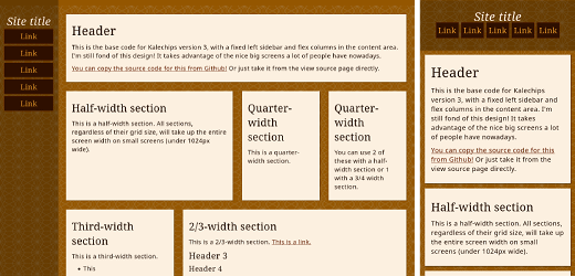
Fixed sidebar
Skill level: Beginner-intermediate
Preview • Download
This is the base code for Kalechips version 3, with a fixed left sidebar and flex columns in the content area.
Floating sidebar

Skill level: Beginner
Preview • Download
This is a very old layout that I've dragged out of the cellar and made mobile responsive.
Fun with flexbox

Skill level: Beginner-intermediate
Preview • Download
This used to be the base for my character website. It has a sidebar with space for some links, a picture, and a description, but its main feature is the grid system used for the main content area. Great if you're looking for an offbrand Tumblr setup!
Notebook

Skill level: Intermediate
Preview • Download
A fork of Fun with flexbox that I used to make a fake Tumblr page. The visual styling is based on the Notebook Tumblr theme (hence the name as I lack creativity).
It is fully fashioned like a Tumblr blog complete with tags and dates (with extra markup to match, yay...) but you can ignore that stuff and go about your day if you'd like.
Panorama

Skill level: Beginner
Preview • Download
This layout is used on Odonata. It is so named because it accommodates a beautiful full-width banner image. It was designed for just a handful of links, but you can theoretically add as many as you'd like without breaking anything. And it has built-in light/dark mode!
Pink Drink

Skill level: Beginner
Preview • Download
I have exhumed a truly ancient piece of code and modernized it for your viewing pleasure. You can rip the source code directly if you only want to use it as a base, or download the whole thing zipped off Github if you want it with all the garnishes.
Pride flags

Skill level: Beginner-intermediate
Preview • Download
A layout and a collection of CSS themes based on pride flags, using CSS gradients for the backgrounds (no images)! These are plug-and-play but still fully customizable. They have a light and dark toggle built in.
You'll need to download the HTML and CSS for your chosen color scheme separately. The base code assumes you're saving the CSS as style.css, but you can fix that if that isn't the case. It also pairs well with my styleswitcher code if you can't choose!
If you'd just like to know how to get the striped background, I have those by themselves as code snippets.
Reader mode blog

Skill level: Beginner
Preview
Download HTML • Download CSS
Simple blog code inspired by browser reader mode. As a bonus, it works with the base Zonelets HTML, so Zonelets users only need to copy/download the CSS file.
Terminal

Skill level: Beginner
Preview • Download
The layout of my UTAU website, loosely fashioned after a terminal window. It works best if you're not planning on putting too many links in the menu. It has space for a banner, and there's built-in light/dark mode.
Totally Tabular

Skill level: Beginner
Preview • Download
The base layout of Brian Aneurysm, designed to look like the shitty table-based layouts of yore without any of the actual tables. Everything is done in Flexbox, so it works on all screen sizes while retaining the overall 2000s look.